 I joined a new department this year at school, the student union publications department, the design committee. My job as a designer is to maintain the aesthetics of the webpage.
はじめに we made a halloween theme, which was pretty cute and such and based on the idea that a student drew the website and slapped it together in class (thus handwritten fonts, torn text sections, cartoon and drawing like decorations). But now we need something more permanent. So, we simply removed the cutesy haunted house silhouette and the other cartoon decorations. (product on left)
Now we need something that is cleaner, less unprofessional, more colorful, and more (coding) flexible.
From top left to right, we have the navigation bar (home, departments, calendar, feedback, useful links), then the upcoming events box on the left, the department ketchup next to that, and the recent articles below that. We've added a news feed box, a video box, and expanded the recent articles to have the same width as the ketchup box. (yet to be posted to the top site)
(Image courtesy Amazon.com)
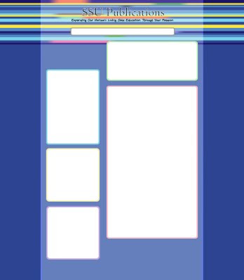
I love Ito En bottled Green Tea (found in the organic section of the produce aisle). So, I'm brushing my teeth and thinking about an idea for the new design when it dawned on me that we could make a design based on the stripes on the label. (I get a lot of Photoshop epiphanies in the bathroom...) Then I talk to basically my boss and he tells me we're going to try a new code which will place an image over a horizontally repeating pixel. OK, cool, sounds easy. BUT it's not easy at all... Creating the stripes themselves to match our school colors and adding the color gradients and such, also picking the stripe sizes... this is what i've made thus far...
